Thinking of designing a banner for your business?
Here are five creative tips to ensure your banner grabs attention, communicates clearly, and actually drives action.
Have a strong call to action.
A typical banner is large, usually around 0.5 x 3 metres and upwards, so it makes sense to use that space to grab attention from a distance. Having a ‘call to action’ to motivate the customer to take a specific action is a way of giving them a gentle nudge in the right direction.
Use easily readable fonts.
Using fancy fonts can detract from your message and make your design look cluttered. It’s much easier to read and increases visibility if you use block letters and proper capitalisation.
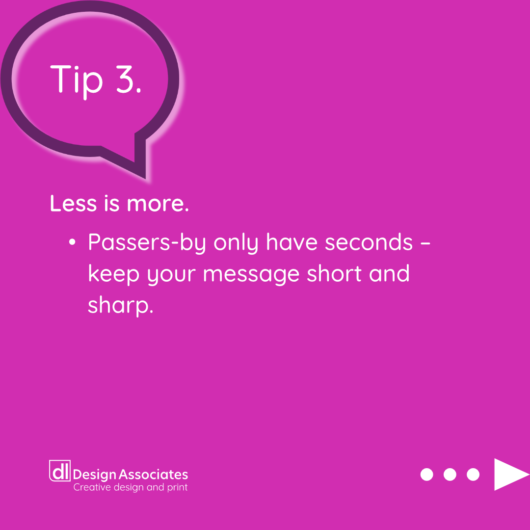
Less is more.
Did you know passers-by only have an average of seconds to read your banner? Keep your message clear and concise. If you can determine the message in fewer than five seconds, it’s a winner.
Think about colours.
Think about the contrast between the foreground and background of your banner; it is one of the most important factors for legibility. You should choose colours that work well together.
Imagery.
It’s said that a picture is worth a thousand words, so using a simple and attractive image can make your design sing, but make sure it is clear and supports your marketing message.


Are you looking for a banner?