How to design a business card people actually want to keep.
Your business card might be the smallest piece of marketing your business has. That doesn't mean it should be an afterthought.
In a world where so much business happens online, it's tempting to think business cards have had their day. But a well-designed business card can still be a useful and surprisingly effective piece of marketing.
The key is that it needs to do more than simply contain your contact details.
A good business card should quickly tell someone who you are, what you do and how they can get in touch. It should also give them a reason to keep it. And that comes down to good design.
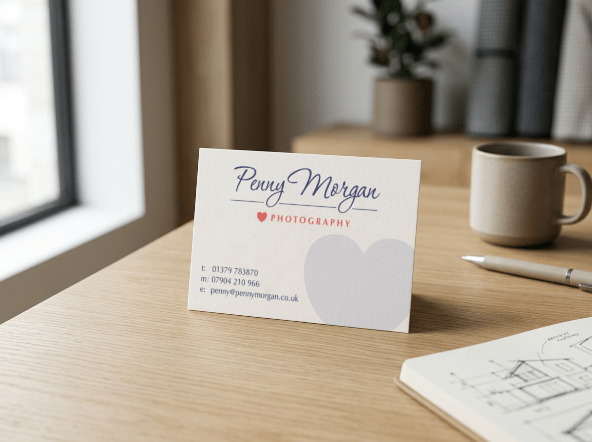
What makes a good business card?
There is no single formula for the perfect business card, but the most effective designs usually have a few things in common.
They are clear, easy to read and professionally presented.
Most importantly, they put the right information in the right place without trying to make every element compete for attention.
A business card has a surprisingly small amount of space available. Trying to fill every available millimetre can actually make the card less effective.
A good business card should do three simple things:
Make it immediately clear what you do.
Make it easy for someone to contact you.
Look professional enough to be worth keeping.
Ideally, it should also look like it belongs to your business and fit naturally with your other marketing materials.
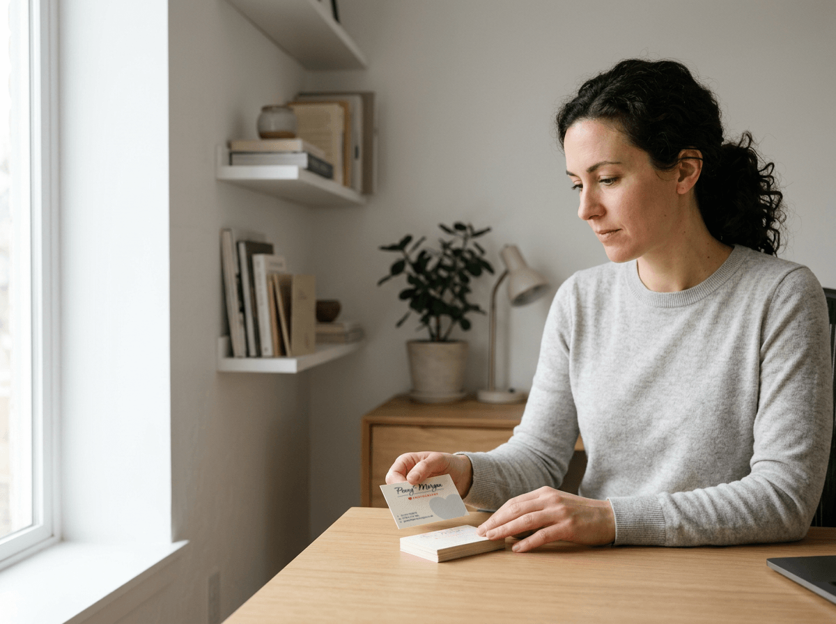
Keep your business card simple and easy to understand.
One of the most common problems with business card design is trying to include too much information.
A typical business card might need your name, job title, company name, telephone number, email address and website. You might also want to include your logo, social media details, address or a QR code.
Before long, you've got a lot of information competing for a very small amount of space.
The solution isn't necessarily to make everything smaller.
Instead, consider what someone actually needs to know.
Your business card isn't supposed to tell your entire business story. Its job is to give someone enough information to remember you and contact you.
Good design uses hierarchy to make this happen. Your name, company name and key contact details should be easy to find without someone having to study the card.
Make it immediately clear what you do.
A business name doesn't always tell people what a company does.
If your company name is familiar or descriptive, this may not be a problem. But if it's a name or brand that doesn't explain your service, consider including a short description or job title.
For example, simply seeing a company name may not tell someone whether you are an accountant, electrician, photographer, consultant or solicitor.
A short, clear description can provide that context immediately.
This is particularly useful when your card is handed to someone at a networking event, exhibition or meeting and then sits in their wallet or on their desk for several weeks.
You want them to be able to look at it later and instantly remember who you are.
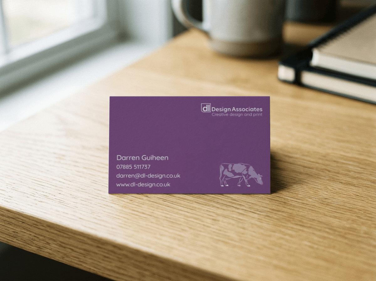
Make your contact details easy to find.
It sounds obvious, but contact details should be easy to read.
There is little point in having a beautifully designed business card if someone has to search for your telephone number or email address.
Think about the action you want someone to take.
Do you want them to call you?
Email you?
Visit your website?
Perhaps you want them to scan a QR code and find out more.
Make that action obvious.
You don't necessarily need to include every possible way of contacting you. In many cases, a telephone number, email address and website are enough.
If you do include social media accounts, only include the ones that are genuinely useful for your business.
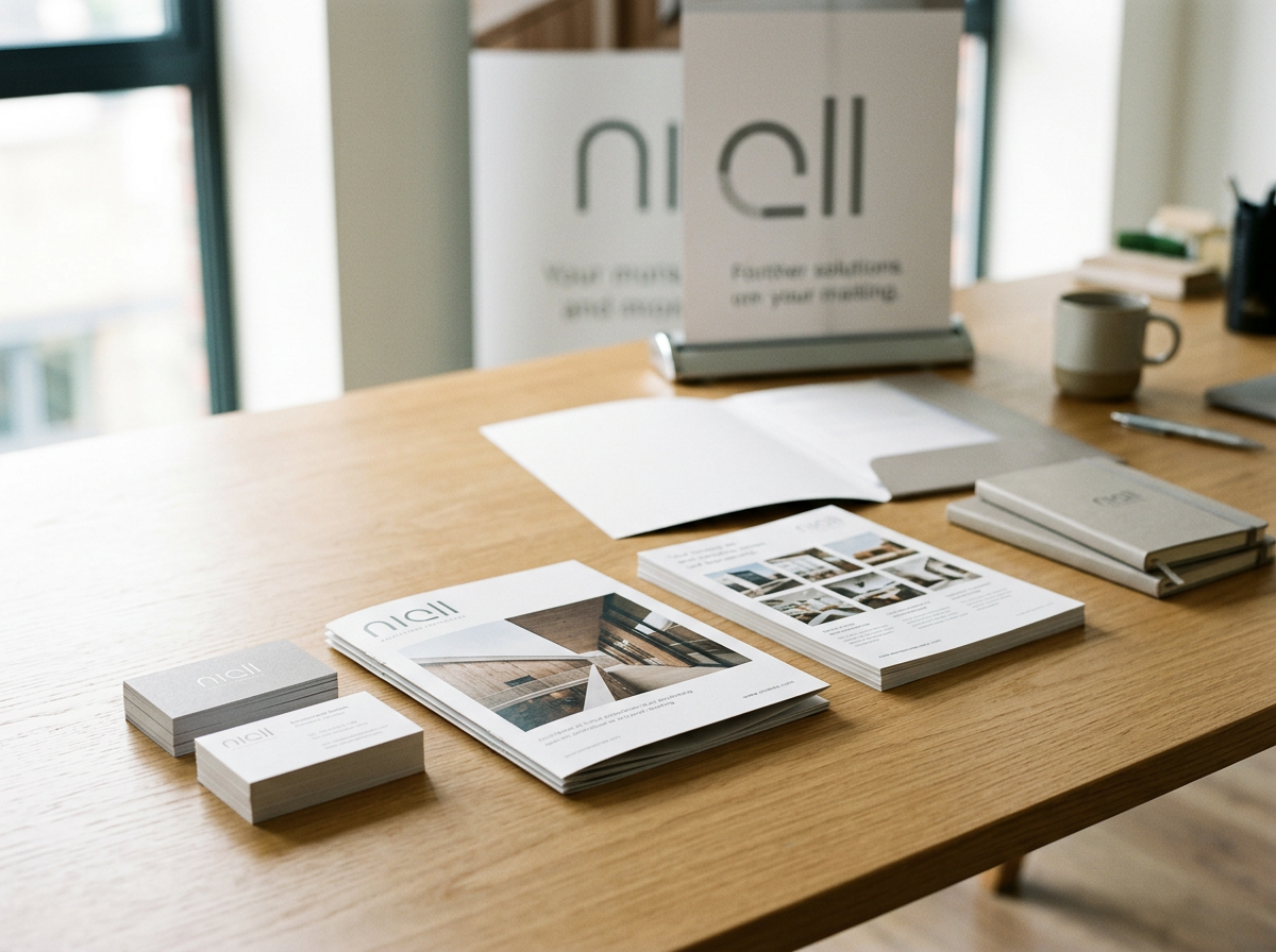
Your business card should look like your business.
Whatever it is, the way you tell your story online can make all the difference.
A business card shouldn't exist in isolation.
Ideally, it should form part of a consistent visual identity across your marketing.
Your website, business cards, leaflets, brochures, roller banners and other printed materials should feel as though they belong to the same business.
That doesn't mean everything needs to look identical.
It means the same branding, colours, typography and overall design approach should carry through your marketing.
This is particularly important if you regularly meet potential customers at networking events, exhibitions or face-to-face meetings.
Someone might see your business card one day, visit your website a week later and then see your roller banner at an exhibition several months after that.
Consistent design helps them recognise your business wherever they encounter it.
Don't be afraid of white space.
One of the simplest ways to make a business card look more professional is to give the content some room to breathe.
White space, sometimes called negative space, is the area around the text, logo and other design elements. It isn't wasted space.
It helps separate information, creates hierarchy and makes the card easier to read.
Trying to fill every available space can make a business card feel crowded and difficult to navigate. A little restraint can often make a much bigger impression. Sometimes less really is more.
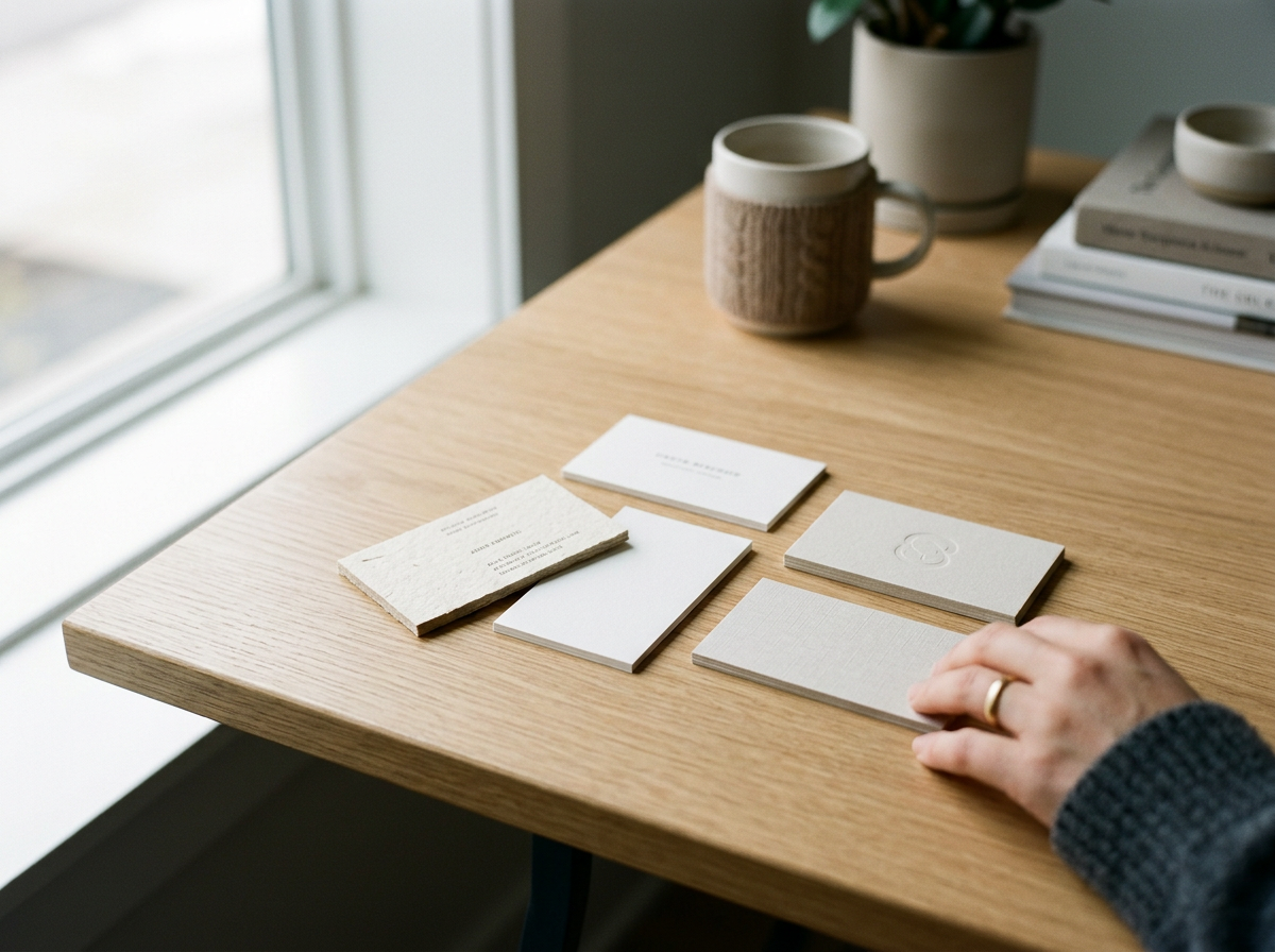
Think about the quality of the print.
Good design can be undermined by poor printing.
The paper or card stock you choose affects how a business card feels as well as how it looks.
There are many options available, from standard uncoated and silk stocks through to heavier boards and specialist finishes such as soft-touch lamination.
You don't necessarily need the most expensive option.
The important thing is choosing a specification that suits your business and the impression you want to create.
A premium finish can make sense for a high-end service, while a simple, well-designed card printed on good-quality stock can be just as effective for many other businesses.
The important thing is that the design and print quality work together.
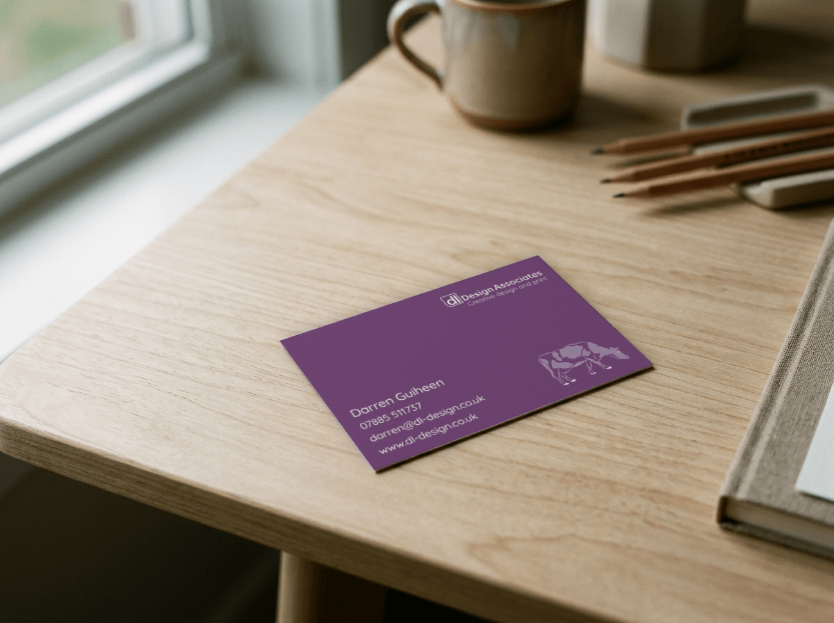
Avoid making your logo do all the work.
Your logo is an important part of your business card, but it shouldn't necessarily dominate the entire design.
A common mistake is to make the logo as large as possible and then try to fit everything else around it.
Your logo identifies your business. Your other information tells people what you do and how to contact you.
Good business card design balances all of these elements rather than allowing one element to take over.
Should you include a QR code?
QR codes can be useful on a business card, particularly if you want to direct people towards a website, portfolio, booking page or contact information.
But they aren't essential. Adding a QR code simply because there is space for one doesn't necessarily improve the design. If you use one, give it a clear purpose. Make sure it is large enough to scan easily and, ideally, tell the person what they will find when they scan it. For example, "View our portfolio" is much more useful than simply placing an unexplained QR code in the corner of the card.
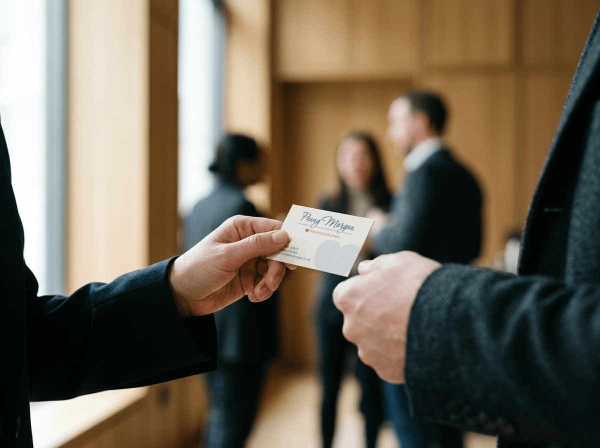
Ask yourself one simple question.
When you're reviewing your current business card, don't just ask whether all the information is correct.
Ask yourself: "Would I keep this?”
Imagine you've just been handed your own card at a networking event.
Would you put it in your wallet or on your desk?
Would you know what the business does when you look at it again three weeks later?
Does it look professional?
Is the contact information easy to find?
Does it look like it belongs to the same business as your website, leaflet or other marketing?
If the answer to those questions is yes, your business card is doing its job.
If not, it might be time to rethink the design.
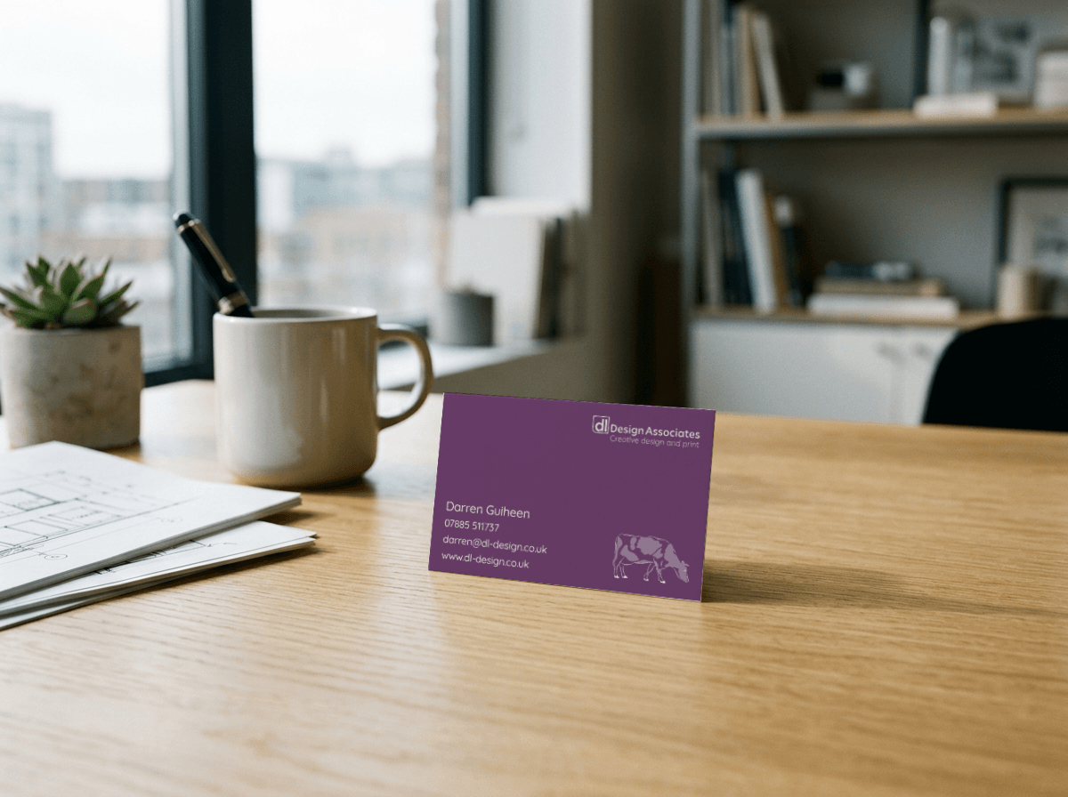
Your business card is small, but your brand isn’t.
A business card may be only 85mm by 55mm, but it still represents your business.
It's often one of the first physical pieces of marketing a potential customer receives from you.
That makes it worth getting right.
A well-designed business card doesn't need to be complicated, crowded or covered in information.
It needs to be clear, considered and appropriate for your business.
And perhaps most importantly, it needs to be something people want to keep.
If your business cards could do with a refresh, I'd be happy to help.
At DL Design, I can take care of both the design and printing, helping make sure your business cards look professional and fit consistently with the rest of your marketing.
Frequently asked questions.
-
A business card should usually include your name, company name, job title or description of what you do, telephone number, email address and website. Your logo and other details such as social media accounts or a QR code can also be included if they are relevant. The key is to include the information people actually need without making the card feel cluttered.
-
A good business card is clear, easy to read and professionally designed. It should make it immediately obvious who you are, what you do and how someone can contact you. Good typography, appropriate use of space, consistent branding and quality printing all contribute to an effective business card.
-
Business card design is important because the card represents your business whenever you hand it to a potential customer or contact. A well-designed card can reinforce your brand, create a professional first impression and make your business more memorable. Poor design can have the opposite effect, particularly if the card is difficult to read or contains too much information.
-
In the UK, a standard business card is usually around 85mm × 55mm. This size is convenient to carry and fits easily into wallets and card holders. Other sizes and formats are possible, but the standard size remains a practical choice for most businesses.
-
There isn't one thickness that is right for every business. A heavier card stock can give a more substantial and premium feel, while a lighter stock can be perfectly suitable for everyday business cards. The best choice depends on your design, budget, brand and the impression you want to create.
-
A QR code can be useful if it takes someone somewhere valuable, such as your website, portfolio, booking page or online contact details. However, it shouldn't be included simply because there is room for one. If you use a QR code, make sure it is large enough to scan easily and explain what the person will find when they scan it.
-
Yes. DL Design can handle both the design and printing of business cards, helping ensure that the finished cards look professional and fit consistently with your wider branding. If you already have artwork, I can also help with print-ready artwork and printing.